2012-09-21

Best Friend shot 02, current progress

I last commented on this shot in August. 

Version 95, from around mid-summer. I overhauled the shot, placing the male character more center stage now. Formerly he was screen R; but it seemed a bit of a viewing strain to be passing the conversation back and forth over such a screen distance, and he had too far to travel for the grab.


Here's some overdraw I did to resolve the grabbing motion. Ref video I have for this is far too uninteresting. However, this still doesn't "land" it; the shot's fairly realistic, and this motion still needs to be toned down further for the guy. Also, his motion needs to be sudden and unexpected, so that actually calls for very little anticipation. This anticipation is way too big.

Version 130. The female character's body is now well polished, and I'm re-blocking the male character with more carefully studied details and subtleties. He's going to be fidgeting a fair bit, I've been needing to better convey a sense of nervousness with him and that will help. I filmed completely new ref video for his frames 1-245. The male character's anticipation is now more toned down.

This shot is proving to be quite complex - which isn't unexpected, of course: this is intended, as I want this to be my graduating demo's opening shot, and want to be able to demonstrate a broad scope. So there's a whole lot going on on different levels. I still haven't gotten into the facial emotive content, but it's coming along bit by bit.

2012-09-17

Spacing analysis: Don Knotts, The Shakiest Gun in the West


Another arc-tracking study. This example of shaky motion comes from "The Shakiest Gun in the West", with actor Don Knotts.
(A longer segment from this scene can be seen on youtube here)
I tracked the tip of the gun. As an instrument, it magnifies a motion that is complex primarily in rotation; the translation would be fairly smooth. Incidentally, if this were animated it would make sense to animate this with a constraint, and it would be important to locate the COG somewhere around the middle of the gun rather than his wrist.
I think a key think to notice from this is that the shaky motion is fairly random. It does hold for about 2 frames and jump in about 1 frame, so there's a slight clustering of points. But it's more "white noise" than "pure tone" vibration.


2012-09-06

Stewie Tennis Camp, finaled


Here's the final version of my Stewie Tennis Camp shot, which I completed in AM Class 6.
I made a frames-to-seconds chart and used Audacity to line up the sound effects after the timing was locked down. Incidentally, I later applied a 2 frame delay to get the audio to sound right. It is always best to animate to audio without a time offset, but when everything's done and over with, putting in that slight 1-2 frame delay does sometimes sound better, especially when it's a given that the camera is a bit of a distance from the subjects. Sound travels 340.29 meters per second, or just over 14 meters per frame / about 42 feet per frame. A tennis court is 39 feet from net to rear, 78 feet in total length - the assumed distance-to-camera in this shot. So, strange as it may seem, a 2 frame sound delay for this particular scene is pretty much spot-on.
Introducing audio also led to introducing a third unseen character: Pro's opponent. in keeping with Pro's girl-power, it only seemed logical that she would be besting a man, to boot. (Who knows where Kid's balls are coming from! Whoever or whatever, the source remains silent and unnoticed.)
Frames 100 - 200 were scrapped and re-done three times over before I finally got that part right. Ironic that the very segment where "nothing in particular" was happening posed a particular challenge. But then again, thinking in such a manner was perhaps the fundamental problem with that segment to begin with. Generally speaking, no moment should be dramatically vacant. "Something in particular" does now happen there, a series of subtle but clear emotional beats. 
Getting the hand-held camera to feel right took a few passes. It was initially over-active and jittery. While this may have been truer to life, it was distracting; hand-held action is best kept low-key.
Pro's hair was fun to animate. It is simply composed of AM's Tailor rig constrained to her head, a hair solution I've seen other AMmers use before. I resolved it intuitively (via "mental simulation," I like to say) by overdrawing existing playblast frames (via Digicel Flipbook), then exported and rotoscoped directly in-camera within Maya. (I used a duplicate non-animated "steadycam", because the rendercam was handheld-animated by then.) When rotoscoping like this, it helps to move the rotoscope's plane close to the camera and make it semi-transparent. Posing to the drawover is then relatively straightforward. I find it interesting that the observing mind does not appear to be very particular about the details of motion with things it does not intuitively understand, so long as the general sense of it seems to hold true. Any sort of complex dynamics (fabric, water, hair) would fall into this category, as does complex physics such as the pendulum dynamics of two or more bones in a chain. What this amounts to is a great opportunity for artistic or creative treatment in these contexts. For example, the sinuous motion of this hair in the air is not physically accurate, but it looks great this way. No physics simulation is going to obtain these kinds of results. Nor will it "know" where motion needs to be subdued and where it needs to be more active. All of which supports the point that dynamic non-living objects are also best given the art-of-animation treatment whenever possible.

2012-08-31

Best Friend shot 01, stages up to end-class

Well, hasn't it been a while since I posted anything in here! Let's look at getting this up to speed once again.
I've finished Animation Mentor now. Had a blast at the graduation, it was great finally meeting  friends and classmates that I had gotten to know over the past year and a half.

I continue to polish my shots toward a completed demo. I'd like to share stages on "Best Friend." This became my main "final effort" in Class 6, the last class at AM. I'll share versions up to my last submission first, then I'll share polish stages and the eventual completed version - whenever that comes about.

Class 6 was busy. A lot of time was consumed polishing my Tennis Camp sequence. This was completed, I was glad to get that wrapped up at least. Meanwhile, Best Friend became the main contender for my lead shot, and I was starting this one from scratch. I challenged myself with a decent amount of activity blended into the dialogue mix, and with a relatively long clip, 16 seconds, as follows:
The clip is from Doctor Who,  Series 6, "Day of the Moon." Yep, I'm a Doctor Who fan. I liked the scenario's ambiguity. The shot seemed to have the potential for exploring the subtlety of an ambiguously defined relationship between a guy and a girl. I wanted it to remain ambiguous, so the viewer would be left guessing: platonic or erotic/romantic? 
Filming ref was a process. After failing dismally at acting out the female role - my body just can't move that way - my wife obliged and did a spot-on bit of acting for the role. I still ended up splicing together a bunch of clips to get what seemed best, and I also ended up with parallel ref versions. This is the main sequence just for Pond:
Sean Sexton, my Class 6 mentor, demonstrated a very interesting approach to blocking, where he forms a very tight sequence of poses, usually around 2-4 frames separated. While this may seem time consuming at the onset, it can be possible to capture the entire "idea" of the shot more-or-less from the get-go this way, and the shot will be well defined and will transition to splines with minimal issues. So, when I did my blocking, I tried this method out for myself:
Okay, well, not quite. What really happened was that I plugged in nicely detailed blocking for the girl in the first 100 frames or so, roughly in twoes. Then in the second 100 frames I started running out of time and it fell back to around fours. Then in the last two hundred frames it was looking more like eights... or is that sixteens? And by the time I got to the guy, I was pretty much completely out of time and reverted back to the 'ol "tentpoles" blocking method once again.
Oh well. Sean said he can block a scene in a day this way. Either it just takes practice or the typical scene doesn't involve quite so much physics and moving around, and is shorter anyway. Yeah, I'm not sure what to make of it all, time-wise. But there's no denying that the high level of detail in blocking, wherever I did have it, produced more accurate motion and reduced complications farther down the road. It's certainly very easy to deceive oneself into thinking there's enough motion-information in there when there simply isn't yet, when blocking.
Another thing that became clear about this method was that it's best for situations where you have straightforward reference to work from, and where the style of motion is fairly realistic. Splices in reference really call for careful attention to resolving the body mechanics in the scene, and those resolutions are fabricated and take more time to iron out.
Furthermore, it isn't just splices that throw this approach off. It's also re-timing. I ended up doing a fair bit of retiming. For this approach to work well, it's good to have reference frames loaded directly into a Maya viewport for easy frame-specific reference. I did experiment a bit with animating the rotoscope timing to make it fit, but ultimately the two no longer meshed most of the time.
At the end of it all, I finished classes with this version of Best Friend in my final submission:
It was still in the rough with a significant amount of work left to be done. The guy was still roughly stepped, and facial expressions had not yet been defined. 

2012-03-11

AM Class 5, Shot 2, latest iteration


Most of the changes this week were made to the second shot in the sequence.
Assuming I don't make any major changes, I've now resolved the most difficult issues, and the rest of  the polish process is a more relaxed matter of working out irregularities and adding details.
I would like Nono to interact a bit more meaingfully with Lillian, though, in terms of her own reactions and focus.
Just starting speech animation here, jaw rotations only so far.

2012-03-06

AM Class 5 Shot 2, coming along


This last week's submission. The first and last shots are now becoming well developed and body mechanics has been generally resolved; Charles, my mentor, has indicated that I must now focus on performance. I've already re-filmed video reference for various details.
We've only got two weeks left for this assignment! Time flies. I must also get the facial animation rolling this week. 
I'm really happy with how Nono's run-away bit has turned out. That quality level needs to be brought across the board now.
A challenge with this shot is that the motion is naturally somewhat soft to begin with. I need to tighten it up, especially in the middle. A "soft section" is a section that's wide open for subtler performance and polish work, so this region is one big blank canvas with lots of room for exploration.
Hopefully I'll even get a bit of that "jiggle settle" and "residual energy" cited by Andrew Gordan in a recent lecture on polishing our shots. These descriptions get at the more complex nature of a good settle, something more sophisticated than simply overshooting the action.
And of course, there's still a lot of the emotive and expressive content to be put in.

2012-03-03

Working in XSI


Just thought I'd put up some screengrabs of my Softimage | XSI workspace as I animate.
I've got years' worth of customizations in here (mostly written in JScript), a very familiar working environment. One thing I struggle with in Maya is dealing with what seems to be a more limited degree of freedom in terms of workspace customization. It's alright in general, but I struggle in particular with the tiny space allocated for custom commands. As you can see, I occupy an entire computer monitor with custom toolbars within XSI (these are collapsible as well, so I can use the monitor for reference etc. as needed). I also do very much enjoy working in 3D, something I've done for a long time via a custom 3D camera setup that I usually use with all of my cameras. This setup uses the Interest null/locator of the camera to define the focal point for the 3D, and maintains a constant (adjustable) angular displacement based on a custom trigonometric expression. The 3D is simply accomplished via crossing my eyes and focusing. Low tech, and one of the the oldest methods of achieving the effect; but of course it being a volumic environment it is effectively as "true 3D" as any hologram, perceptually. No expensive goggles or screens needed; with just a bit of tinkering anyone can do it with their existing setup.

2012-02-26

Two run cycles


Two run cycles. Studies toward my current shot's ending. Which cycle is better? 03 or 04?
It's an interesting comparison.  The cyclic motion of the first is given a node on the hips; the cyclic motion of the second is given a node on the head. It feels as if the first is more typical of a starting acceleration, and the second is more typical of a high-speed run. Perhaps because of this, the second "feels" faster, even though both are traveling at the same speed.

I was happy to find that Nono could take this kind of motion without looking too odd in her outfit. Rigging that dress was a study in itself.

2012-02-21

AM Class 5 Shot 2, early rough stages

So here's my Class 5 Shot 2 in its early rough stages.
I'm really eager to move past this point. However, I do want to ensure I cover enough ground at planning stages to enable decent results. This clip shows video reference with drawover planning for keyframes and breakdowns. The drawover work permits me to think it out a bit more carefully before I actually launch into the posing process; aiming to put thought before actions.
After the basic poses and blocking ideas are in place, segments can also be given additional layers of detail sourced from further processes of re-filmed ref or analysis of other sources. And then, around that point, it also takes on a life of its own and most refinement continues via reflecting directly on the scene, and putting in changes based on feedback.
The blocking here is still very rough, lots left to be done before blocking is complete. I'm so glad we have a few more weeks for working on this assignment!

2012-02-14

Connect Four Breakdown Analysis, a set of solutions


So… here you have it: my main set of answers to this “connect four” challenge:


Here are six solutions to this challenge:

Circle evenly timed, Circle favoring alternate points,
Square evenly timed, Square favoring alternate points,
Star bounce, Star bounce cartoon edit

Many other solutions are also possible, though there probably aren’t very many more that are appealing. (e.g. In terms of making a complete study of transitions, anticipate and overshoot would need to be represented. These would be “somewhat floral”, with a small loop at each knot) For now (shortly), I’ll be focusing on these six timings at greater depth.


Solution: Stepped

 
Before getting into the above breakdown situations, let’s take a look at the blocking for this cycle (in stepped keys).
The keys are distributed evenly in time.
So for 24fps, this puts key poses on 1, 7, 13, 19, 25
(or 0, 6, 12, 18, 24, it makes no difference, but I went with odds here)

First and last frames are identical, playblast less one frame for a loop.


A note to clarify what I’m showing: the upper left panel shows a drawing of the path of action, the upper right panel shows the result, with ghosting, in 3D, and the lower panel shows the animation curves that produce these results in the graph editor / animation editor.

As we have just seen, in blocking the four key poses are always the same, and are also always spaced and timed the same.
So this challenge has only one blocking solution, and this blocking can lead into ANY of the above timings.
(Lesson: blocking in stepped keys can be interpreted into many final timing solutions. Blocking is a simple representation of many timing possibilities.)

But… “Animation: it’s all in the timing and the spacing” (said Grim Natwick, according to Richard Williams)
To a beginner, the above blocking might simply be converted directly into splines and that would be that. This is exactly what leads to that typical “beginner’s look” with animation, also known as drifty, floaty, or underwater feel.

Next CFBA posting: getting into the splines.


2012-02-09

The Connect Four Challenge, an Introduction


Here is a trail of animation analysis I’ve been exploring, that I’d like to share.
I intend to post it as a series of thoughts, which lead into some potentially useful insights into the basics of timing and spacing, and patterns of keys in the graph editor, accordingly.This posting is the first in the series.
 

The "connect four" challenge

The basic challenge is as follows:

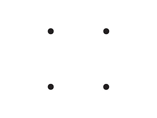
Take a set of four dots in the same pattern as seen on a dice.
Consider each dot to be a key pose in a second-long animated loop.
Connect the dots with keys that are evenly distributed both in timing and spacing.

Simple, right? After all, both the timing and the spacing are clearly defined. So if you key those poses at the right times and places, you get your answer and you’re done, right?
Well, maybe. For one solution. But there are many solutions.

So the challenge is this:
Consider a variety of solutions and implementations, making an effort to resolve each solution with just those four keys in the graph editor.
(To limit obvious alternates, all solutions assume a same start/finish point, a clockwise path direction, and the use of the orthographic XY plane)

It’s an intentionally simple scenario, yet oddly enough there are still many answers to the question. Initially, I meant only to examine the answers in 2d form. But when I applied the answers to 3D effort, I realized that there was more to the matter yet again, because for each answer there were also many ways of implementing that answer in the context of rigging and animation curves (Lesson: something which seems simple will typically become complicated in ways that were not anticipated.)

When I ran the challenge through some of the most obvious answers and implementations, I was able to confirm a variety of animation rules of thumb. It was also a generally decent technical study good for solidifying some basic concepts in 3D animation. 

... more to come later! Feel free to comment if you'd like to have a go at the challenge for yourself (before I give away my own set of answers!) 

2012-02-07

Dialogue - layout

  
Layout for my current dialogue shot.
That's some awful animation. It can only get better from here. But the point is to resolve the camera work and placement of elements. After doing this, I realized that both of the cuts were a bit delayed, for example.

2012-02-03

Dialogue selection, Ghost story

... and on with our first dialogue shot!
After many weeks of searching... watching a number of movies and TV episodes along the way (including, incidentally, the last few seasons of Doctor Who)... I did a complete about turn during this last week and shelved all the potentials that I had gathered up! Why so? I wanted to approach this more from a character perspective instead. In particular, having lately put my own rigs back to work again with the facial expression assignments, I've opted to do this assignment using my own rigs rather than with Bishop or one of the ten "potentials" AM provides for our use.
The characters I made for the Hero Book movie are all kids, with the exception of Faith. I had a half dozen adult characters slated for creation as well, but the job folded before I got that far (they were only going to show up in the closing "Club of Life" scenes). So I have these assets sitting around. I've really been wanting to put them to a more rigorous test now that I'm advancing in animation skill.
I spoke with Charles about it, and now I'm going to take the plunge.

The two characters I chose for this shot are Nono ("sadness" face) and Lillian ("happiness" face). So they will now be playing the parts, respectively, of Dianna and Anne (the clip is from Anne of Green Gables, the classic 1980s CBC series). I had considered using Lillian and Sibusiso ("disgust" face), but there's a bit of an age gap, Sibusiso's a few years older. She's also really tall so she'd be difficult to frame, and I just don't see her playing along, she's too mature.
Nono's a bit petite for Dianna, so it's a similar problem in the opposite. But I think she's a good fit emotionally for acting out the transformation from fear to abject terror. And Lillian's a perfect match for Anne, and shows an appropriate hint of mischief for this particular moment. Or rather, more to the point, it's really Dianna and Anne who are matching to Nono and Lillian. Anyways, I meant to show them together, so here we are:
Dianne (Nono)    Anne (Lillian)

Once I determined to find a clip that was appropriately dramatic and which involved children, the range of possibilities narrowed down dramatically.
I do like the fact that this shot will be exploring a friendship-dynamic. It's a bit more unique, there seem to me to be more shots happening with amour relationship dynamics. Charles also pointed out that the use of a ghost story is more unique. I do know of one other AM dialogue that has involved a ghost story... might as well track that one down so as to take note... student showcases, Summer 2008, Richard Fournier, there we are. "Sphaghettios with meat!" Haha. That was a nice one.

Well. Lots to be done. Planning phase: it's an odd feeling to be shifting from polish back into planning again. I've got 8 weeks of screaming to endure now. But rather than allow that to incrementally drive me crazy, I'll most certainly be preparing a swap-out clip with that screaming dialed way down!

AM Monologue, done for now

So here's my pending monologue shot.
I have a list of things I'd still like to do to polish it further. Still, probably it's best for now to not touch it for a little while. Then when I take a proper look at it again, it should be easier to be objective about what needs to be done next.
Charles Alleneck is my current mentor. I really like the level of detail he puts into his critiques. He's very specific, it really helps with the fine-tuning on shots.

2012-01-25

Paul Ekman's seven basic emotions


Anger

Fear

Sadness

Disgust

Happiness

Surprise

Contempt


Class 5 is now well underway for me at AM.
Seeing as I'm still not quite ready to share my finished work on my Thief shot, I thought I might as well share this series of faces.
We were free to choose any seven facial poses we wanted, actually. But I took it as an opportunity to consolidate my understanding of "the primary colors" of expression, so to speak.
Apparently Ekman went on to add a whole bunch more "basic" emotions after these had been formalized. But they're an excellent cornerstone in the whole facial posing and animation process.
For those not familiar, the idea behind these expressions is that they have been demonstrated to be understood in all cultures, across the board. Both the exressions and the moods they communicate are therefore believed to be instinctual, part of what's written into our fundamental human nature. It's interesting to think about this, just how much of what we are is granted from the get-go. For example, if I'm not mistaken, other examples of this sort would include our ability to use and understand a tonal musical system, the ability to recognize and interpret faces, our inherently social nature, and it may be that the list just goes on and on. 

This was the first bit of AM assignment work with which I used my own rigs. I think they're standing up quite well so far, I'm happy about that. They still lack contour controls for the mouths and eyes. If I get back to animating them in a meaningful way again, I'll need to attend to some of these details that could really give them final polish. But as first efforts.. not half bad. I'll point out that I spent quite a lot of time refining them, bit by bit over the course of years. It's great to dust them off and put them to some work once again.

Strengths and weaknesses: Bishop, while having some very nice fine tuning controls, still leaves me wishing for more. More wrinkleage, especially in terms of the smile crease. I find it tough to do without that, for emoting. But every rig will have limitations, and complexity is often as much as sign of poor design as something advantageous.

Aside from just having gotten access to "super Bishop", as I like to call him (Bishop 2.0, which can be made into all sorts of characters), the AM-exclusive rigs suite has now been expanded to 10 new rigs. Where to find the time to try them out? It's a very welcome development, and they're quite an interesting set of creatures. I'm particularly happy to see male characters with "meaningful shoulders" in the set. Bishop's shoulders are a bit limiting, they're so narrow as to seem almost non-existent, and don't convey much visually as a result. Or maybe it's just his big head that makes them seem that way. Anyway, nothing to complain about, not in the least. Animation Mentor's rigs are awesome, all-told, and designed specifically to take growing animators through their paces one important element at  a time. All, of course, without the distractions of rigging and CG: it's all about character animation, "plain and simple" (or antithesis thereof).

Over Christmastime I did some explorations in splining. It's kind of academic, but I may share it in a future posting.